FARMAPLAZA
Merchandising
How to grow aligning the brand of a Pharmacy,
or convenience store
with its new business vision
Background
FARMAPLAZA, a small four-pharmacy chain located in the Andean region of Venezuela, in Merida and Trujillo states, considered the fact that for a continued growth, the brand needed renovation, in line with its new business vision since the identity and the brand colors were associated to another chain of pharmacies.
Strategy
Redesign the brand, align its communications and apply them to all the stores
Solution
After interviewing the client, the organizational basis of the business was developed and the following were determined: Mission, Vision, Values of the Organization and attributes of the brand. Once the organizational communications were defined, the design process of its new brand was begun; its corporate colors, font and positioning declaration, “Variety, Health and Well being”, were created.
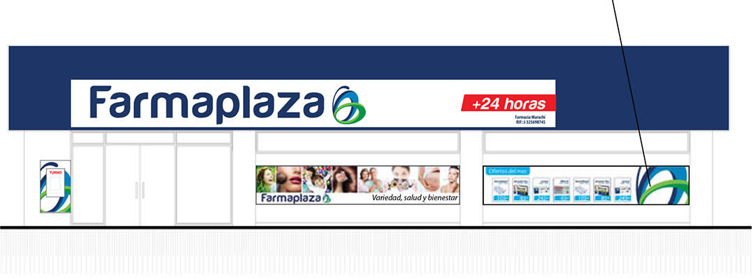
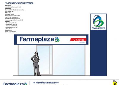
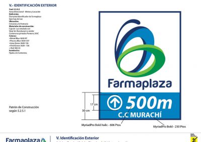
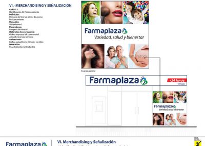
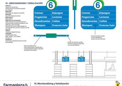
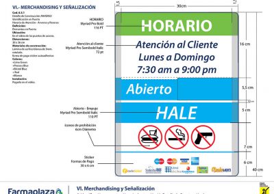
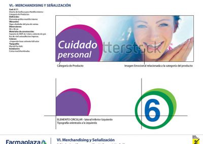
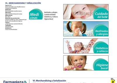
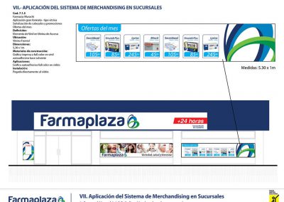
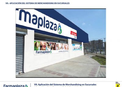
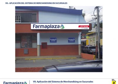
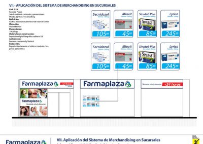
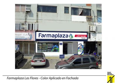
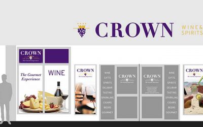
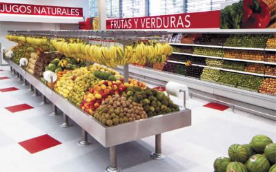
The applications of the design, both in its exterior sign as on the sales floor, provided the store with a new image that enhanced its brand, store network and its competitiveness.
Project Details
- Upgrading logo/emblem
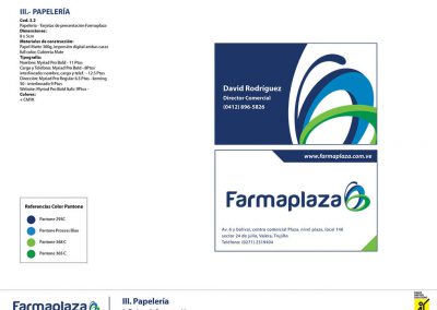
- Corporate Identity
- Brand Architecture
- Communications
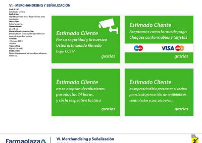
- Signage
- Merchandising System
- Architecture and Merchandising Manual
- Brand Manual

