OSIX
Branding
How to redesign your brand
taking it to the maximum level of appeal,
using visual Merchandising at your store
Background
OSIX STORE, the name of the brand when they came to us, needed to boost its brand in its stores in Latin America: Panama, Costa Rica, Honduras, El Salvador, Dominican Republic and Venezuela.
Strategy
A naming process to improve the reading of the name, redesign of the logo, and establishing Management by Categories guidelines in order to reorganize their produces on the sales floor of the store, thus boosting the clients’ purchase experience.
Solution
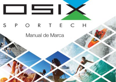
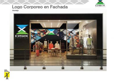
Starting with the diagnostic if its logo “OSIX STORE”, the new brand, OSIX SPORTECH was designed with a more dynamic, irreverent, sporting and technological identity. This new identity became the starting point for the applications on the facades, showcases, and interior spaces with high-impact visual elements.
Internally, the Commercial Strategy of the store was designed, defining the role of the category for each department.
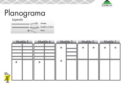
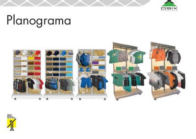
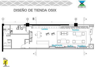
Together with the Commercial Strategy, was designed the Visual Merchandising for exhibiting the products in the sales area in a more efficient manner, increasing the clients’ traffic flow and obtaining more profitability per square meter.
Project Details
- Branding Project
- Logo and Applications Redesign
- Positioning
- Commercial Strategy
- Visual Merchandising
- Brand and Franchise Manual

